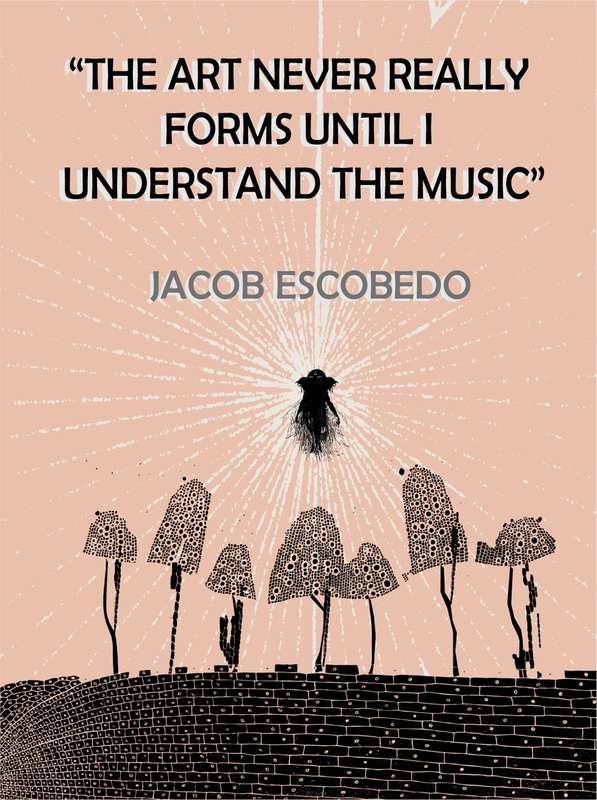
For this assignment, we had to research an artist and make a poster representing them or their works as a whole. I chose Jacob Escobedo, an arist living in Atlanta, Georgia, who is not only the creative director of Adult Swim on Cartoon Network, but also creates album and merch artwork for bands like Danger Mouse, Gnarles Barkley, The Broken Bells, Vampire Weekend, Matt Costa, and The Shins, who this poster was inspired by. The Shins happens to be a band that I really like, so naturally I wanted to incorporate that into my poster. The background picture was originally a sort of poster advertising a concert in Paris. All I really did was color over the words with the matching background color and type over it with a quote by Escobedo. This quote, to me, embodies him because not only does it represent what he does as an artist, it also shows that he wants to understand his work and make it great, not just do it for money.
Wayne Thiebaud, born in 1920, is commonly affiliated with the Pop Art movement. Many of his more well-known works consist of images of cakes, pastries, and makeup. Colors in these images tend to be bright and shadows are usually exaggerated. Repetition is also a common theme in his paintings, as none of them include just one object. The duplicates and copies represent a sort of production line. This repetition occurs because of Thiebaud's fascination with mass culture, also known as consumer culture.
Aside from the desserts, Thiebaud paints things like landscapes, cityscapes, and various characters such as Mickey Mouse. Thiebaud considered himself to be a painter, not an artist. Painting consumed his life. From the time he was 18, he has worked as a cartoonist in California and New York, where he continues to live and work today. Studying Wayne Thiebaud for this artist study was an obvious choice, as his subject matter is similar to mine. I am also influenced by his use of color and shadows and admire these qualities. They are two things I strive for in my work as well. I also just love the Pop Art movement. The fact that Theibaud supposedly had some influence on this movement makes him even more appealing to study. It's interesting that he had friends like William de Kooning, Robert Rauschenberg and Jasper Johns, who are all artists I like and have studied before. While researching Thiebaud, I also learned not only about his life but also about how he created some of his more popular images. By focusing on the subject's basic shape and isolating shapes in the colors of the object, he was able to create defined, crisp images. This is a technique I want to incorporate into my work to make the images have more of a pop art quality. Additional Resources: http://www.nytimes.com/2012/11/09/arts/design/wayne-thiebaud-retrospective-at-acquavella-galleries.html http://www.smithsonianmag.com/arts-culture/Wayne-Thiebaud-is-Not-a-Pop-Artist.html Lee Price is a figurative painter from New York who has been painting self portraits for over twenty years. Her work may seem strange and unorthodox at first, but they have a much deeper meaning. Each one focuses on the relationship between food and body image, addiction, and desire. Many of Price's paintings portray personal struggles she has had with food and her own body image. All of the food featured is junky, unhealthy food. According to Price, "no one gets excessive with carrots." However, indulging on unhealthy food is something everyone can relate to. Price's goal in creating these images is to emphasize and expose the secrecy of compulsive behavior. The private settings (bedrooms, bathrooms, etc) indicate the absurdity of compulsive behavior.
Price is the artist that originally inspired the work I make now. I liked the idea of struggling with food and compulsive behavior, as it's something I struggle with sometimes too. I also liked how strangely she portrayed this idea. It's obvious yet subtle. That subtleness had me wondering how I could convey this idea subtly as well. That's how I got the idea of hiding words in the food. I like that you don't notice them at first; much like how Price's notion doesn't hit the viewer right away. Another thing I really like about Price's work is the contrast found in it. The peaceful, private settings greatly contrast the frenetic, compulsive behavior of the subject. In my work, the bright colors contrast with the negative words hidden in the subject. To learn more about Price and view her current works, visit her website at http://www.leepricestudio.com/ |